Brrr: Predicting Building Energy Ratings
2026-03-24
If you've ever rented or bought a home in Ireland, you'll be familiar with Building Energy Ratings (BER). They tell you how cold you'll be in winter, graded from A1 (toasty) through to G (cold). "BER Exempt" means you're in for a rough time.
To get your BER, an assessor takes dozens of measurements, pokes at every vent, crevice and hole, then produces a number: the cost to heat the building in kWh/m²/year. That number gets bucketed into a category from A1 to G:
| Rating | kWh/m²/year |
|---|---|
| A1 | ≤ 25 |
| A2 | 25 - 50 |
| A3 | 50 - 75 |
| B1 | 75 - 100 |
| ... | ... |
| E2 | 340 - 380 |
| F | 380 - 450 |
| G | > 450 |
The Sustainable Energy Authority of Ireland (SEAI) is responsible for BER, and they handily publish an anonymised dataset.
Can I, a proven idiot, use machine learning to predict a home's BER using only information a homeowner is likely to know? No crevice exploration required?
This is a short series of posts to figure that out. What I tried, what worked, what didn't.
What does the data look like?
Pandas to the rescue. I still don't feel fluent with it, it's very different from idiomatic Python, but so much easier than loading a dataset into an SQLite database before prodding it.
import pandas as pd

bers = pd.read_csv(
  "berpublicsearch.tsv",
  sep="\t",
  encoding="latin1", # Irish gov agencies love Windows encodings
  on_bad_lines="skip",
)
rows_before_filter = bers.shape[0]
bers = bers[
    (bers["GroundFloorArea(sq m)"] < 500)
    & (bers["BerRating"] < 1000)
    & (bers["BerRating"] > 0)
    & (bers["Year_of_Construction"] > 1900)
    & (bers["Year_of_Construction"] < 2027)
]
rows_after_filter = bers.shape[0]

print(f"loaded {rows_before_filter} rows, "
      f"dropped {rows_before_filter - rows_after_filter} rows,"
      f" continuing with {rows_after_filter} rows "
      f"({rows_after_filter/rows_before_filter*100:.1f}%)")
Gives a respectable ~1.3 million rows to play with:
loaded 1353346 rows, dropped 84070 rows,
continuing with 1269276 rows (93.8%)
There were some funky numbers in the raw data:
- 4 homes from the future, with construction years of 2033, 2073, 2029 and 2104.
- 4,007 homes with a negative BER rating (currently burning?)
- 5,381 homes with a BER above 1,000. Given G is the lowest score and starts at 450 kWh/m²/year, that's impressively bad
I'm limiting this to homes that exist now, were built after 1900 and have a BER that technically counts as indoors (< 1000).
Does this need ML?
If one or two features of a home dominate the BER calculation, I might get to skip a complicated prediction model that's learning hidden relationships. How simple can I go?
I tried some guesses.
Bigger houses are more expensive to heat?
bers.plot.scatter(x="GroundFloorArea(sq m)", y="BerRating", alpha=0.1)
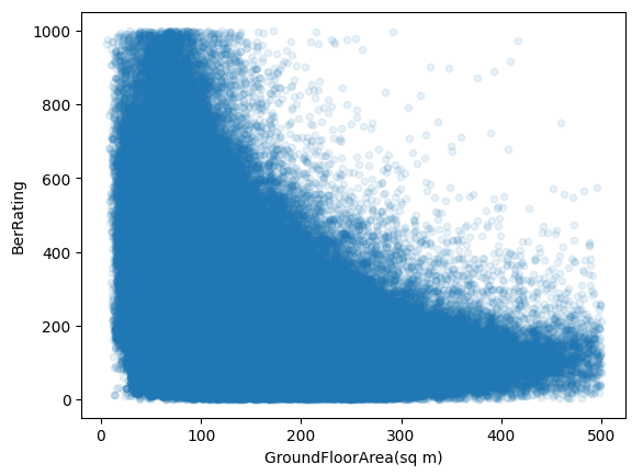
No, but there is some relationship and it's kind of the opposite. In the graph above, lower numbers on the y-axis (BerRating) are better, more energy efficient. As the building gets bigger (GroundFloorArea goes up), the trend is a lower BerRating.
Now that I think about it (and I have a graph proving me wrong), BER is energy per square metre, not total energy. Bigger houses likely have a better ratio because heat loss scales with surface area. Floor space grows faster than exposed wall space.
Correlation in numbers
We can use pandas built-in corr() correlation function to explain how correlated floor space and BER are:
bers[["GroundFloorArea(sq m)", "BerRating"]].corr()
| GroundFloorArea | BerRating | |
|---|---|---|
| GroundFloorArea | 1.000000 | -0.242384 |
| BerRating | -0.242384 | 1.000000 |
This is a Pearson correlation.
Wikipedia has an "Intuitive explanation" section:
The correlation coefficient can be derived by considering the cosine of the angle between two points representing the two sets of x and y co-ordinate data. This expression is therefore a number between -1 and 1 and is equal to unity when all the points lie on a straight line.
My intuitive explanation would be:
When floor area is above average, does BER also tend to be above average? If yes, push the correlation towards +1. If the floor area being above average generally means BER rating is below average, push towards -1.
Perform that calculation for every sample in the dataset, then scale the result to somewhere between -1 and +1. A result of +1 would mean BER is exactly tied to floor area.
My -0.242 result implies a weak negative correlation, which is what we see in the graph.
Does the type of roof dominate?
Flat roofed buildings might be older or in worse condition?
bers[
    ~bers["PredominantRoofType"].str.strip().isin(["Other", "Select Roof Type", ""])
].boxplot(column="BerRating", by="PredominantRoofType", rot=90)
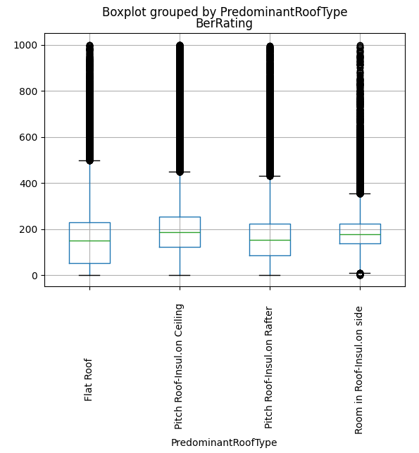
Not really. Flat roofs are a bit worse but not dramatically so.
Are newer houses better?
Newer builds are subject to stricter building standards. Does that correlate?
bers.sample(10_000).plot.scatter(
  x="Year_of_Construction",
  y="BerRating",
  alpha=0.1,
)
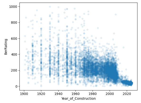
| Year of Construction | BerRating | |
|---|---|---|
| Year of Construction | 1.000000 | -0.624506 |
| BerRating | -0.624506 | 1.000000 |
This is the clearest signal so far. Newer builds skew much more efficient.
You can also see from those bands of dots at decades that assessors are probably estimating and picking nice round numbers (1920, 1930, etc.) for older houses.
Heating type?
There're a few different heating systems listed in the data:
bers["MainSpaceHeatingFuel"].value_counts()
MainSpaceHeatingFuel
Mains Gas                         439685
Heating Oil                       420407
Electricity                       331109
Solid Multi-Fuel                   26755
Bulk LPG (propane or butane)       15559
Manufactured Smokeless Fuel         6036
House Coal                          2178
Wood Pellets (bulk supply for       1845
Bottled LPG                         1098
Sod Peat                             953
Wood Logs                            574
Wood Pellets (in bags for seco       300
Peat Briquettes                      186
Wood Chips                            64
Anthracite                            46
Electricity - Off-peak Night-R        45
Electricity - Standard Domesti        30
Biodiesel from renewable sourc         4
Electricity - On-peak Night-Ra         3
Bioethanol from renewable sour         1
None                                   1
Name: count, dtype: int64
Let's map them down to a smaller set:
bers["MainSpaceHeatingFuel"] = bers["MainSpaceHeatingFuel"].str.strip()

HEATING_FUEL_MAP = {
    "Mains Gas": "Gas",
    "Heating Oil": "Oil",
    "Electricity": "Electricity",
    "Solid Multi-Fuel": "Solid fuel",
    "Bulk LPG (propane or butane)": "LPG",
    "Manufactured Smokeless Fuel": "Solid fuel",
    "House Coal": "Solid fuel",
    "Wood Logs": "Solid fuel",
    "Wood Pellets (bulk supply for": "Solid fuel",
    "Wood Pellets (in bags for seco": "Solid fuel",
    "Peat Briquettes": "Solid fuel",
    "Bottled LPG": "LPG",
    "Sod Peat": "Solid fuel",
}

bers["HeatingType"] = bers["MainSpaceHeatingFuel"].map(HEATING_FUEL_MAP, na_action="ignore").fillna("Other")
How does that compare against BER?
bers.boxplot(column="BerRating", by="HeatingType")
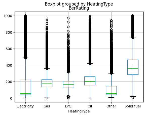
Electricity is the winner! That's a good, clear signal. I'd like to know what's in the "Other" category, there are ~22,000 rows with no detail in this column in the source data.
Year of construction + heating type = BER?
How close can we get with just year of construction and heating type? (In data science speak, regress BER on construction year and heating type).
The simplest model for this is linear regression.
Linear regression
Linear regression finds a straight line (or flat plane, if you have multiple features) that best fits your data. Like when you carried out a science experiment in school, plotted the individual data points then drew a trend line that matched the one in the textbook.
If our model was capable of predicting BER from year of construction alone, it might learn something like:
BER = 1200 - 0.5 * year
For a house built in 2000, that predicts a BER of 200. For a house built in 1960, it predicts 220. The model is just a simple formula with a slope and a base value (the base value is called the intercept). Training it means finding the slope and intercept that produce the smallest overall errors.
Adding more features, like heating type, is the same idea but with more dimensions. Instead of finding the best line, it finds the best plane. The maths gets a bit more involved but the concept is the same.
Trying it out
Data science convention is X for the features and y for the answers we're trying to predict (known as labels):
X = bers[["Year_of_Construction", "HeatingType"]]
X = pd.get_dummies(X, columns=["HeatingType"], drop_first=True)
y = bers["BerRating"]
pd.get_dummies does one-hot encoding. These models can't work with text labels like "Gas" or "Oil" directly, so we convert each category into its own column.
If a house is heated by gas, the HeatingType_Gas column gets a 1 and everything else gets a 0.
drop_first=True drops one category to avoid redundancy.
If we had 3 heating types: Gas, Oil, Electricity, we'd only need HeatingType_Gas and HeatingType_Oil since Electricity is represented when both those columns are 0.
We split our data into training and test sets (see my post on overfitting for why):
from sklearn.model_selection import train_test_split
from sklearn.linear_model import LinearRegression

X_train, X_test, y_train, y_test = train_test_split(
  X,
  y,
  test_size=0.25,
  random_state=42,
)

regression = LinearRegression().fit(X_train, y_train)
regression.score(X_test, y_test)
Score: 0.4535
That means our model is explaining about 45% of the variance in BER ratings.
This score is called R² and it measures how much better your model is than having no model at all.
The simplest possible prediction is to just guess the average every time. If the average BER is 250, you'd predict 250 for every single house. You'd be wrong a lot, but you'd be wrong in a measurable way. R² would score this baseline as 0.0.
R² compares the model's errors to that simple baseline. A score of 0.45 means the model has eliminated 45% of the error that the "just guess the average" approach would make. The remaining 55% is stuff your model can't explain yet.
An R² of 1.0 would mean the model is always correct.
0.45 is not great, but it's a start.
Kitchen sink approach
What if I take all the features in the dataset that a homeowner might reasonably know? Size of house, roof type, number of storeys,etc, and leave out hairy things like wall U-values.
bers["WaterHeatingType"] = bers["MainWaterHeatingFuel"].map(
  HEATING_FUEL_MAP,
  na_action="ignore",
).fillna("Other")
bers["StructureType"] = bers["StructureType"].fillna("Other")
bers["NoOfSidesSheltered"] = bers["NoOfSidesSheltered"].fillna(-1.0)
bers["PredominantRoofType"] = bers["PredominantRoofType"].fillna("Other")

numeric_cols = [
    "Year_of_Construction",
    "NoStoreys",
    "NoOfChimneys",
    "NoOfSidesSheltered",
    "GroundFloorArea(sq m)",
    "GroundFloorHeight",
    "PredominantRoofTypeArea",
]

category_cols = [
    "HeatingType",
    "WaterHeatingType",
    "CountyName",
    "DwellingTypeDescr",
    "StructureType",
    "UndergroundHeating",
    "WarmAirHeatingSystem",
    "PredominantRoofType",
    "HESSchemeUpgrade",
    "PurposeOfRating",
]

dataset = bers[[*numeric_cols, *category_cols, "BerRating"]]
dataset = dataset.dropna()

X = dataset[[
    *numeric_cols,
    *category_cols,
]]
X = pd.get_dummies(X, columns=category_cols, drop_first=True)
y = dataset["BerRating"]

X_train, X_test, y_train, y_test = train_test_split(
  X,
  y,
  test_size=0.25,
  random_state=42,
)

regression = LinearRegression().fit(X_train, y_train)
regression.score(X_test, y_test)
Score: 0.6219
The model now explains about 62% of the variance. Better, but still not good.
Linear regression assumes a straight-line relationship between each feature and the output. That's probably too simple to predict BER. A house built in 1970 with oil heating and poor insulation behaves very differently from a 1970 house with oil heating and good insulation, a straight line won't capture that well.
Next up: gradient boosting.